New website redesign! Jumping from 2012 to 2017
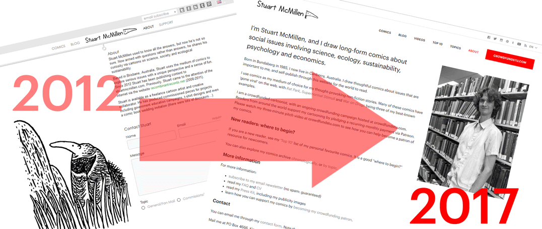
This redesigned version of my website replaces the previous version of the site that launched in April 2012 – over five years ago. Five years is a long time in internet-years, and a lot has changed with best-practices for websites since 2012. The major change is the rise of smartphones and small screens as the seemingly-dominant way that people now access the web.
My old website went through a number of Frankenstein-like hacks to give it touchscreen support, and responsive design scalability. But it became clear that sooner or later I would need to revise and redesign the whole website.
Recoding it all from scratch
In the past, I have had some annoying experiences employing web developers who were located in different countries (and timezones) to me. Because of this, I wanted to avoid this pitfall with my 2017 redesign, and employ some devs who were based in the same city as me. People who I could physically meet with, to talk through issues quickly.
For this redesign, I employed the service of a company from my coworking office: Neucode. From the initial mock-ups of the website, through to the final product, it was clear that they had a solid understanding of what I wanted from my website design.
Rather than tinker with the old codebase, Tai and Jaz from Neucode thought it would be way more efficient to redesign and recode the whole website from scratch. Fine with me!
I am really happy with the design of the new website, and how the front end looks. It is a visually-appealing way to display my cartoon artwork. A pleasant surprise is how happy I am with the back end of the new website. The admin dashboard of the website is intuitive, with menu items nicely arranged and ordered. This is a nice change to my old website, which required me to remember to do a labyrinth of steps to do simple things like Add a new comic, or Add a new item to my Public Speaking list.
So, Neucode gets two thumbs-up from me!
What’s new? What’s different?
-
- Responsive design built-in. On the old website, I used workaround methods to create smartphone-friendly menus, and scalable design. This time, it is built into the code from day one.
- More up-to-date design. The website simply looks better designed, with nice use of white space as a design element. Instead of cramming everything into a compressed space, the Neucode team used white space as a way of drawing attention to the graphics and text that we chose to feature.
- Greater emphasis on graphics. Both the old and new websites wisely used my black and white artwork as a prominent part of the style and design. But the new site uses my graphics more stylishly. The new website better incorporates my graphics into the design of the whole website. For example, see below my comparison of the top Top 10 list (very text-heavy), and the new Top 10 list (uses thumbnail images to give a preview of the piece).
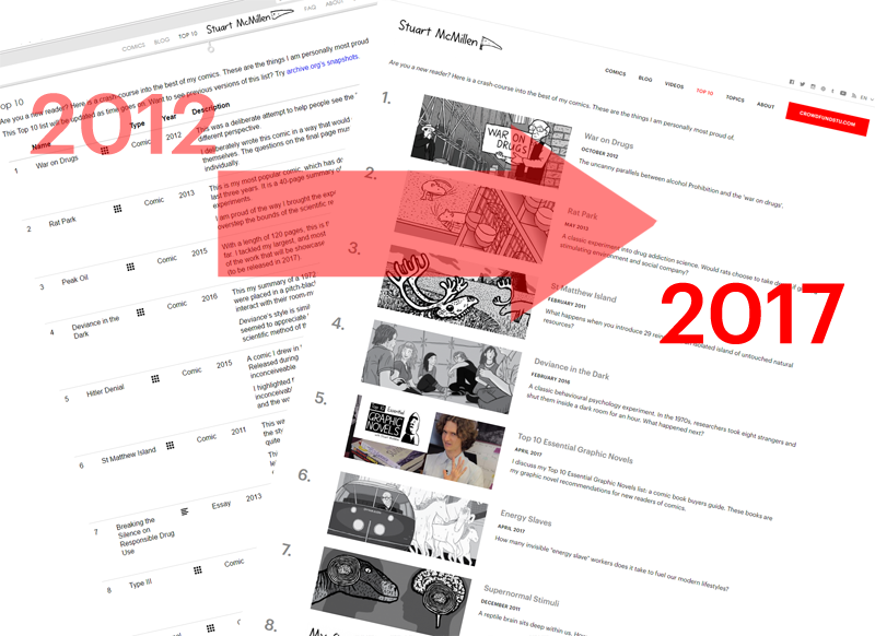
[Above: comparison of the old ‘Top 10’ list (left), and the new ‘Top 10‘ list (right). Note the use of thumbnails as a more prominent part of the design.]The Blog archive also looks more stylish. We have moved from the old square 150 x 150 pixel thumbnail images, up to thumbnails that either display at 360px × 152px or 557px × 236px.

[Above: comparison of the old Blog archive (left), and the new Blog archive (right). Note the use of larger thumbnails.] - Better left-to-right scrolling of my comics. The old website’s left-to-right comics were an innovative idea for 2012. But the implementation had drawbacks. For example, if a reader got all of the way to the end of my 58-page Deviance in the Dark comic by pressing the Right Arrow key 58 times, they would not easily be able to navigate back to the previous website that they were browsing. They would have to press the Left Arrow key 58 times(!) There were a small number of other quirks and oddities like that.
The new redesign fixes these issues, and gives users a multitude of options for navigating through the comics using mouse, keyboard and touchscreen.
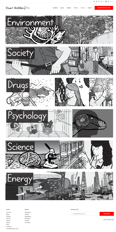
- Topics section. Previously, the only way that readers could access my back-catalogue was via the chronological list comics in my Comics Archive. With the new website, I realised that it would be helpful for readers if I explicitly listed all of the categories that I have published on. Society, Psychology, Drugs, etc.
- Increased visibility of my photograph on the website. My philosophy as a ‘public person’ has changed greatly since I originally launched my website five years ago. As you can see, in this 2012 archived version of my About page, I originally did not appear in photographs on my website.
My original idea was to be the hidden ‘unseen man behind the curtain’, with readers decoding my comics without knowledge of the identity of the artist.
Things changed with my 2012 Rat Park crowdfunding video, when I showed my face for the first time. Since then, I have increasingly been shooting videos of myself. Firstly, fundraising-related videos. And lately, videos that are interesting in their own right, such as my Top 10 Essential Graphic Novels comics recommendations.

- Videos section. In the same vein as the last bullet point on this list, I have now added a ‘videos’ section to the top menu of the website. My decision to list ‘Videos’ as a prominent new menu item follow this general trend away from me solely being a comics artist. Instead, now I am a more well-rounded communicator. Therefore, it makes sense to emphasise the videos that I have created.

- White and black – with dabs of red. The website continues my old website’s tradition of using white and black as the main colours of the design. But it also uses red in several places to draw attention to important design elements. Including: my crowdfunding button, my email-subscribe form, and a horizontal scrollbar beneath the comics.
- Clearer emphasis on the crowdfunding campaign. The new website’s design emphasises my hope that readers will support my comics via my crowdfunding page. This message was muddled by the old design, and by the old copy. Previously, I was emphasising a way that readers could support my work with once-off donations (by buying $2 PDF versions of my comics). This was a convoluted idea which I have removed from the new design.

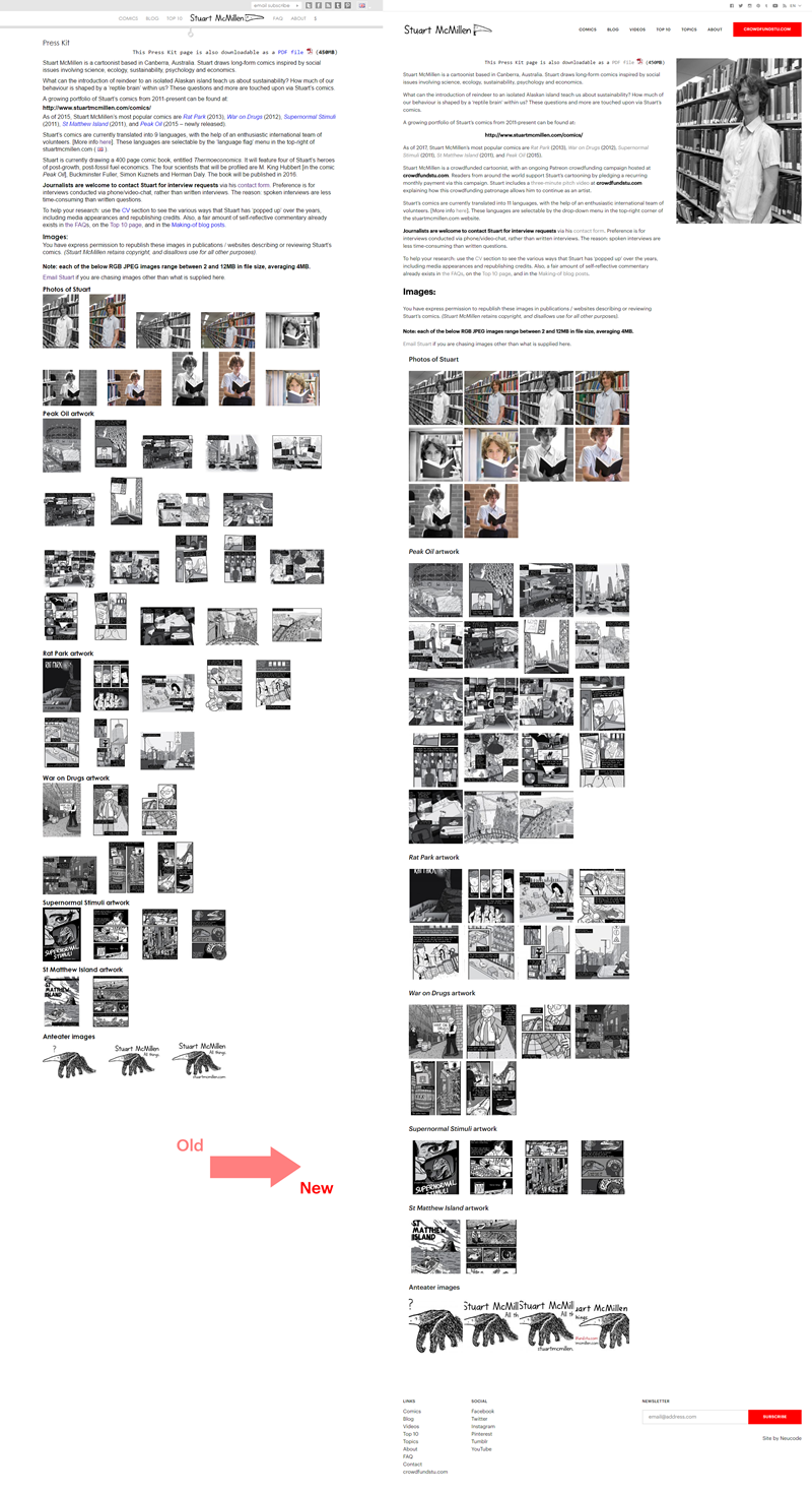
Now, there is a heavy emphasis on joining my Patreon campaign via the URL crowdfundstu.com that is heavily emphasised on the new design, with a big red button. I have also tweaked my About page and Press Kit to emphasise the fact that I am a crowdfunded cartoonist.Hopefully this re-designed website encourages more readers to join my monthly crowdfunding campaign. Maybe you are a reader who can support my art?
My new Topics page shows a snazzy list of the major topics that I write about. On each of the sub-pages—for example, the Environment page—I write about the reasons I choose to publish comics on that topic, and then list some of my favourite comics, essays, and videos on the topic. All of this is bookended by some of my most visually-stunning artwork on that topic.

Redesign screenshots
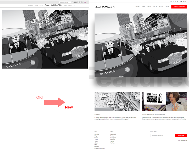
Above: Home page old versus new, showing the two extra slots I now have for featured content.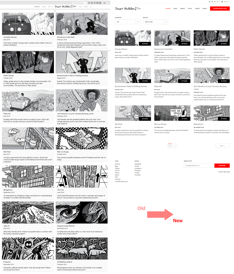
Above: Comics Archive old versus new. Now I am showing the page count for each comic (auto-generated, based on the number of images uploaded).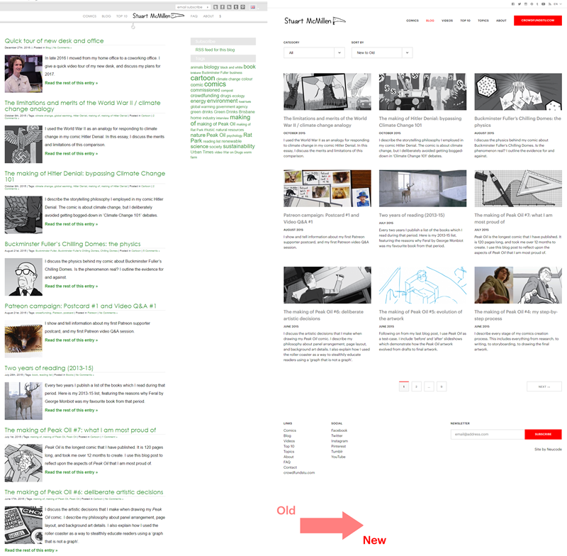
Above: Blog Archive old versus new. Now, all blog posts are featuring a large horizontal preview image, compared to the small square 150px thumbnails from the old site.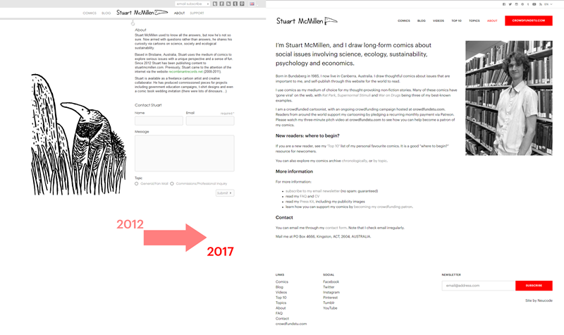
Above: About page, old versus new. This compares my original 2012 About page, which did not even show a photograph of me.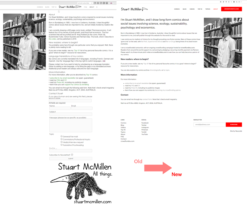
Above: About page, old versus new. This compares the most recent version of the About page, which did feature a photograph of me.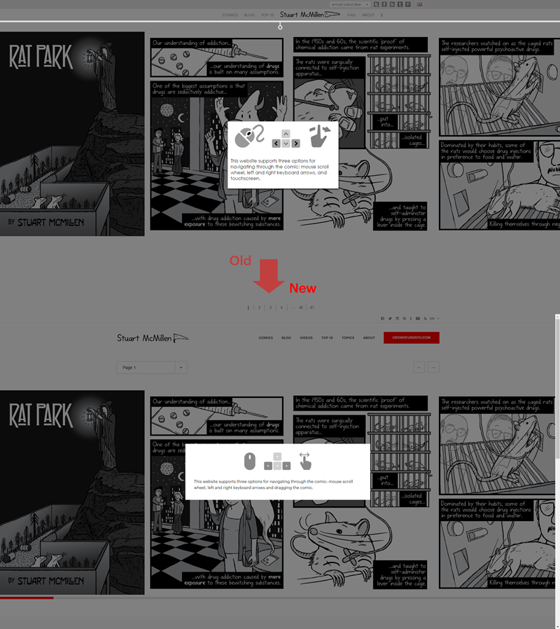
Above: Single comic page, old versus new. This is the initial navigation instructions that the user first sees upon loading a comic.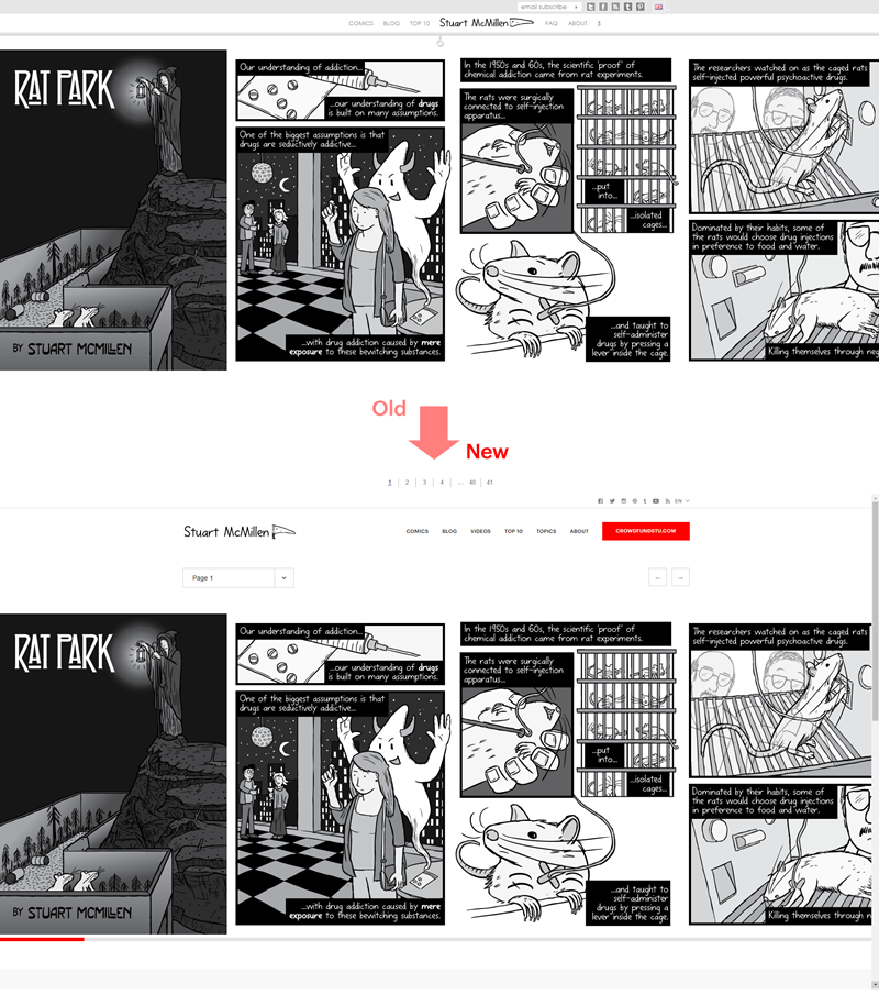
Above: Single comic page, old versus new. Now there is a drop-down menu and left-right buttons within the website. We had to remove the ‘use the scroll wheel to navigate left and right feature’, due to the new coding of this page.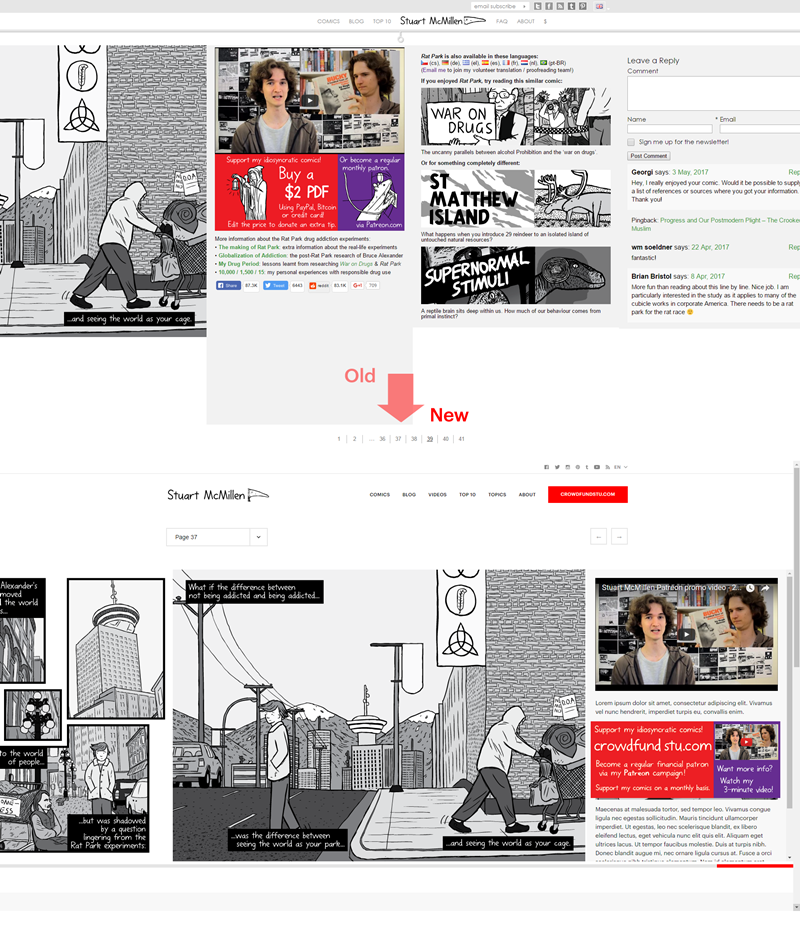
Above: Single comic page, old versus new. The user Comments and Related Posts have been moved to underneath the comic itself.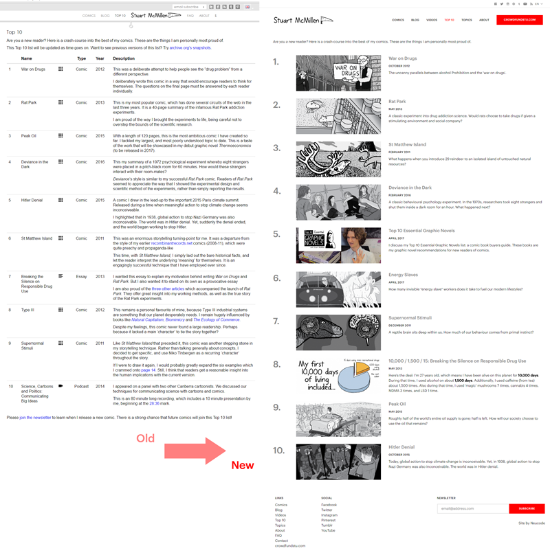
Above: Top 10 page, old versus new. This new list uses the rectangular featured images from the other Comics archive (etc) pages.


Comments