The making of Peak Oil #6: deliberate artistic decisions
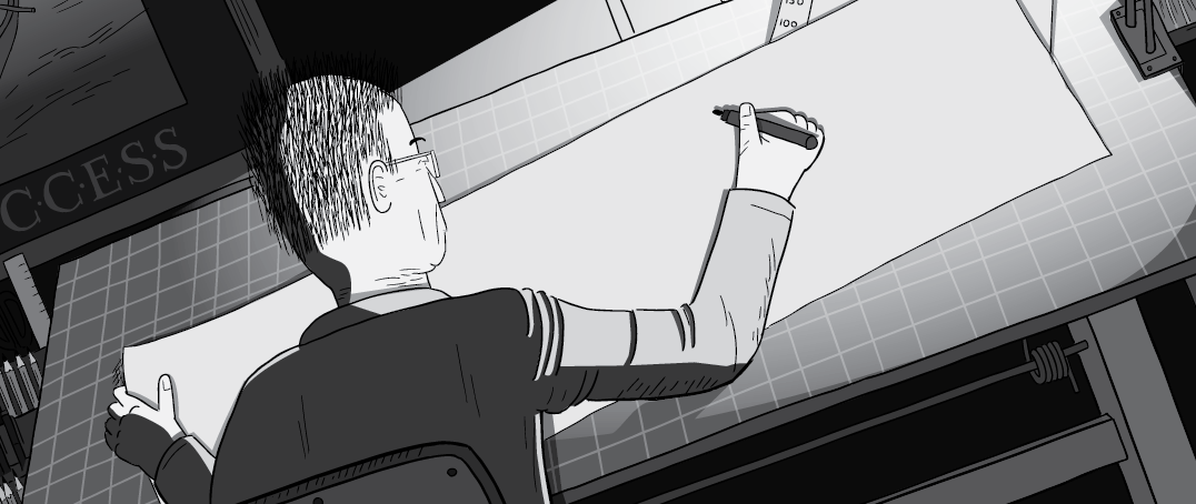
This is the sixth in a seven-part series covering various aspects of the Peak Oil comic’s creation process.
Earlier in this essay series, I described the deliberate storytelling decisions I made when planning Peak Oil. With this blog post, I describe the deliberate artistic decisions that I made with my graphics.
Pulling my socks up to draw Peak Oil
I am a slow artist without formal training, and I only draw cartoons when absolutely necessary. I am not a ‘doodler’!
I am genuinely only motivated to draw cartoons for the purposes of illustrating points about topics that concern me. Because of this, my artistic ability only develops at roughly the same speed as the rate I publish comics to stuartmcmillen.com.
Peak Oil is arguably the most daunting global issue that I have so far tackled through my comics. I was determined to make the comic feel extra special, with top-notch artwork illustrating the story.
Increasing the visual density of my graphics
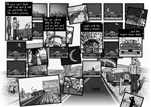
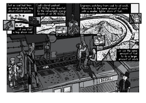
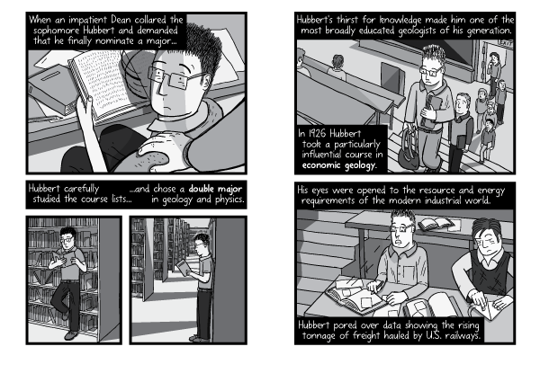
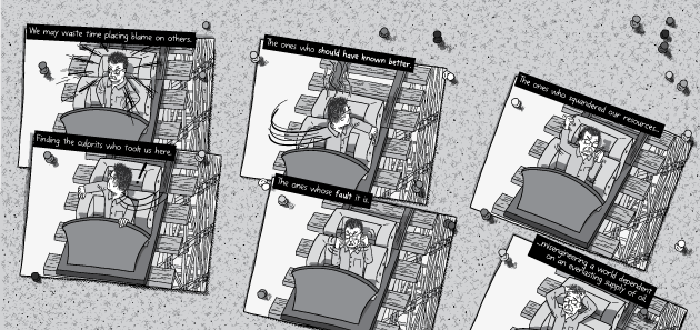
One of the decisions I made when storyboarding Peak Oil was to make the graphics feel denser than anything I had drawn before. This explains the heavy use of layered ‘insert panels’ on spreads like the two highlighted below:
With these scenes I aimed for readers to be able to follow the main thrust of the page by simply reading the captions, and quickly glancing at the most prominent artwork. But for those who chose to linger and scour the artwork, I wanted there to be lots of graphical detail to reward close inspection.
My decision to increase the graphical density of my artwork occurred after I read the books Floating Horizon by Chris Guest, and The Great War by Joe Sacco in July 2014. (I describe those books in greater detail here.)
Adding variety, and breathing room
However, I understood that I could easily spoil the impact of these dense, layered pages by overusing the effect. To remedy this, I also included a number of sparser pages, to allow readers to rest their eyes momentarily.
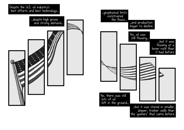
This mirrors the textual approach that I described in the blog post about my storytelling philosophy. Comics are a dance between words and artwork. Sometimes it helps to let one of these elements dominate, and to let the other rest. If an artist is skilled, this ebb and flow will subconsciously result in a captivating reading experience.
Education by stealth: the Peak Oil roller coaster
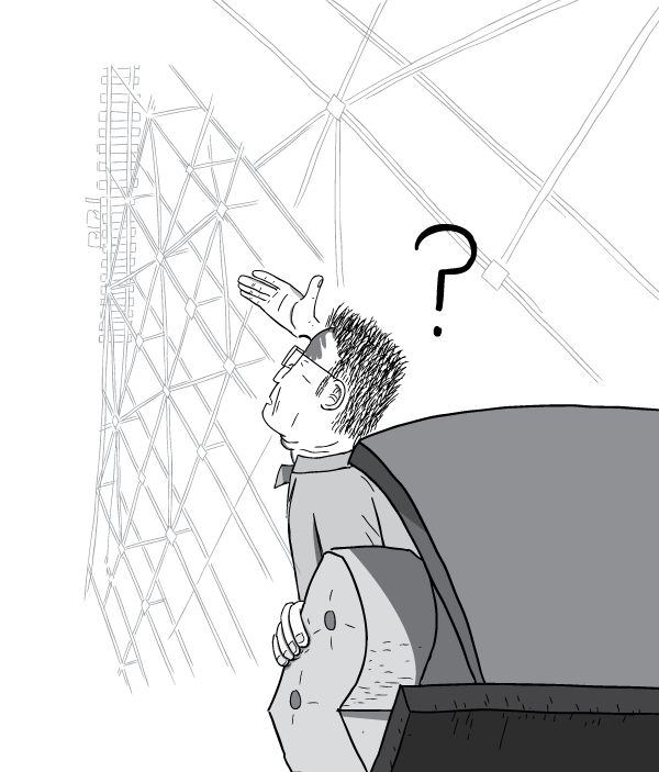
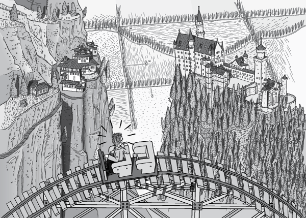
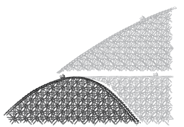
The roller coaster was an effective way to show a ‘graph that is not a graph‘, and to avoid my comic’s readers from being too overwhelmed by data.
Yes, it is a shame that I have to safeguard against internet users with short attention spans. But that’s part of my job. I draw comics primarily to communicate with mainstream people who are unaware of certain worldly issues. In doing this, I have to continually find ways to disguise the fact I am educating readers about serious topics!
Importantly, I don’t feel like I compromised the base facts that sit behind the artwork of Peak Oil. I feel like it is a factually accurate comic, with the added bonus of sporting appealing graphics.
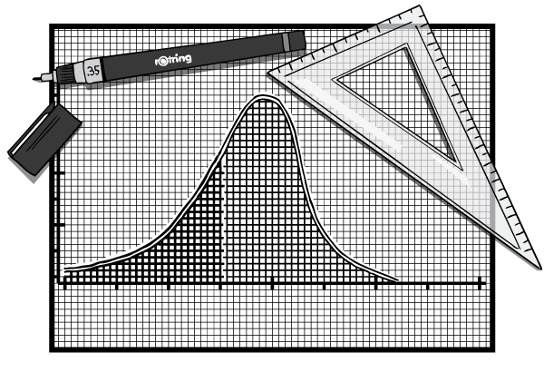
This is a welcome contrast to the factually accurate, but bare-boned comics that I drew earlier in my career. For example, compare Peak Oil (2015) to my comic about carbon taxes, Green Tax Shift (2010).
Page layouts: walking the line
It is a mistake for cartoonists to think that they should draw comics with a fireworks-display of dazzling artwork. Many classic comics, such as Art Spiegelman’s Maus and Alison Bechdel’s Fun Home are notable for their conservative, restrained graphics and page layouts.
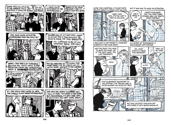
Above: sample pages from the classic graphic novels Maus (1986) by Art Spiegelman (left) Fun Home (2006) by Alison Bechdel. Note the conventional panel arrangements.
As philosopher David St. Hubbins said, there’s a fine line between stupid and clever.
I tried to walk this line with Peak Oil. The majority of pages are based upon boilerplate right-angled panels, without any experimentation.
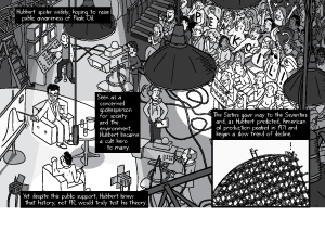
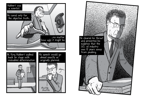
But every now and then, I livened up the comic with some visual flair. For example, Hubbert’s hand breaking the border on page 7, as he makes his stunning announcement.
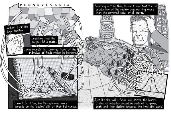
Or the complexity of the p48-9 double-page spread, which illustrates how state and national production curves are merely the summary of their components.
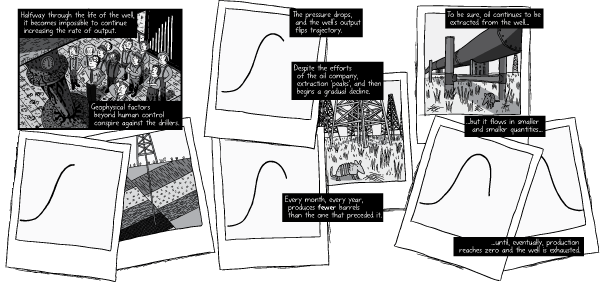
There were also sections where I let the text dominate, and gave the graphics a ‘looser’ role. In these situations, the graphics illustrated whimsical imagery that was only vaguely connected to the story.
The prime examples of this are Miriam Hubbert’s Polaroid photos on pages 39-45.
A similar effect is created with the on-ride photos stuck to the corkboard on pages 108-11.
Background artwork details
Finally, I am trying to gradually loosen up my artwork, and include more background details.
I do my best to make my comics suitably readable at smartphone resolution, but have also decided not pander to phone users. After all, the comic is being designed to be ultimately printed into a book. So that is the resolution that I am most concerned about getting right.
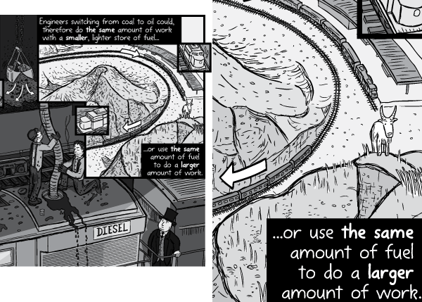
Above: Smartphone-resolution artwork (left). Versus a blown up version of the same page (right) showing a mountain goat unnoticeable by at smartphone screen resolutions.
Smartphone users can adequately read the text, and get a general sense of my graphics. But there are some neat touches that are not visible on mobile devices, and are barely visible on desktop PC web browsers. Some of the graphical detail will only be noticeable by readers of the book.
Humorous things in the background
Following the advice of mates like First Dog on the Moon, I am gradually building a larger amount of obvious and not-so-obvious humour into my comics. These are generally drawn into the background, and are generally not noticed on first glance. I hope these subtle elements reward repeat reading.
I like the idea of my narrator and main character (Hubbert, on this occasion) pushing in one direction, with the background parts of the artwork subtly undercutting the story’s thrust.
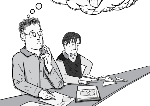
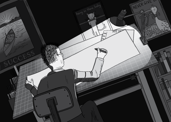
Examples from Peak Oil are the student with the paper aeroplane on pages 12, 13 and 19. And Hubbert’s Successories motivational posters on pages 86-7.
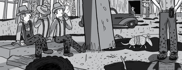
For the record, there are 10 armadillos drawn into the comic’s artwork. Can you find them all? [Note: there is an additional eleventh armadillo drawn into the bonus artwork of book/PDF version]
A call for patrons
As the below video describes, I am currently drawing three other comics in a similar vein to Peak Oil.
Can you ‘pay it forward‘ toward your next stuartmcmillen.com comics-reading experience?
If so, please become a recurring monthly supporter via crowdfundstu.com. Thanks in advance!
Other ‘making of Peak Oil‘ articles
This is the sixth in a seven-part series covering various aspects of the comic’s creation process. Next in the series is The making of Peak Oil #7: what I am most proud of.





Comments